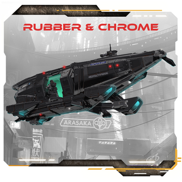
Rubber & Chrome
Chooms, lemme tell you, our whole design team is excited to bring vehicles to the Combat Zone tabletop. It wasn’t easy, though. Ours is a simple engine with a lot of potential, so adding a feature that covers everything from aerodynes to superbikes comes with a lot of guiding principles. To make the myriad of overlapping design goals digestible, let’s boil them down into three main goals and look at how different departments applied them.
Maxim the First: Style over Substance Fans of Pondsmith are familiar with this phrase. It’s baked into the bones of Night City, and it defines the slick visuals of Cyberpunk. When we describe the world, a fixer doesn’t “wait for the Edgerunners.” She “lounges beneath dripping neon.” It’s good guidance for GMs running the Cyberpunk RED RPG, but it’s also guidance that our modeling team took to heart.
The cycles, in particular, are a great place to showcase this. The rider options include the expected rider position, of course. This lets the hobbyist lean the bike, suspend it with clever modeling, or otherwise use the model in dioramas. The bikes are also separate from the rider, so you’ve got all kinds of style options. One that comes to mind is modeling a team member leaning against a parked bike. There’s nothing stopping a little cycle-kit creativity from giving our teams a bit more of that Cyberpunk style.
Rule B: Smooth Like Butter So, a deep-cut element of graphic design for games is how the visuals of the cards and other game tools influence the enjoyment of the game. That may seem obvious, but who doesn’t prefer a game with a distinct aesthetic appeal? There’s a lot of unseen science that goes into making a game intuitive, and the graphic design team is instrumental.
A good example of this is the Vehicle cards. Their color palette and design are different from Character cards, making them easily recognizable at the table. Each Vehicle has two cards as well. One with the various game stats and another with seating. This way, players can physically place their model on the bike card they’re riding or seat models in a car visually. You don’t have to ask your opponent which bike has their Netrunner on it; you’ll be able to see it. That also makes some of the Vehicles, like cars or the Herakles, have tarot-sized cards.
Guideline 3: Nudge, don’t define. Then, we come to the rules themselves. Our design team got to speak with a lot of fans at conventions over the last year, and we also ran a small playtest of some of our rule concepts. We’ve learned, we’ve taken feedback from the community, and we’ll continue to do that. One thing we are keen to get right is the place of vehicles in the game. This is a skirmish game, and we don’t want to take away from the effectiveness of Characters on foot or require that the game start drastically escalating points. So, balance is an important consideration.
But that doesn’t mean we can’t break out of the competitive environment for some unique scenarios and vehicle-focused mayhem. Vehicles make larger play areas more accessible for smaller teams. Players with large terrain boards will find vehicles especially helpful.
So armed with those general guides, we find ourselves in the midst of a Kickstarter; fingers crossed that you’re all as excited to get motorin’ as we are here at team Monster Fight Club!
Join the Cyberpunk RED: Combat Zone™ - RePrint and Vehicle MAYHEM Kickstarter today.


